Animation shows changing geography of where COVID-19 cases are growing the fastest.

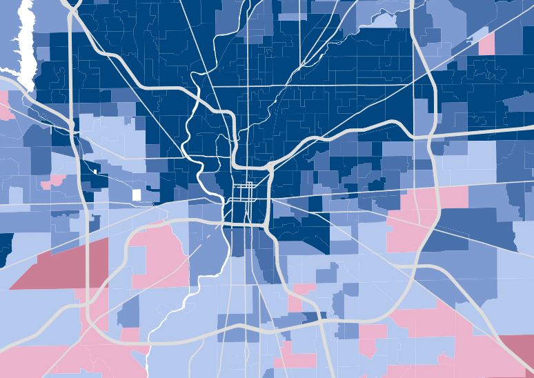
Explore Indianapolis through six years of detailed election data.
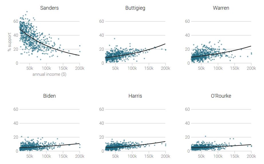
Small donor data reveals how occupation relates to support for 2020 Democratic presidential candidates.
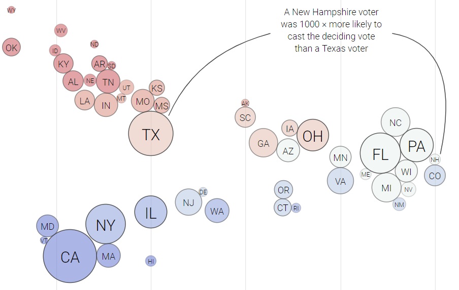
America's strange electoral process creates vast disparities in the impact of votes for president.
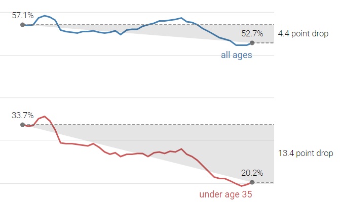
Homeownership rates can't tell the whole story of the decline in homeownership.
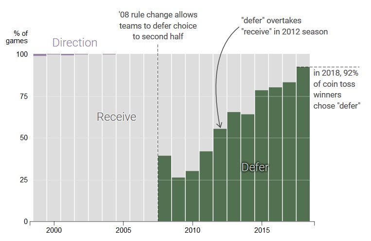
Today, coin toss winners almost always choose to defer, but it took time for deferral to gain popularity in the years after it was introduced.
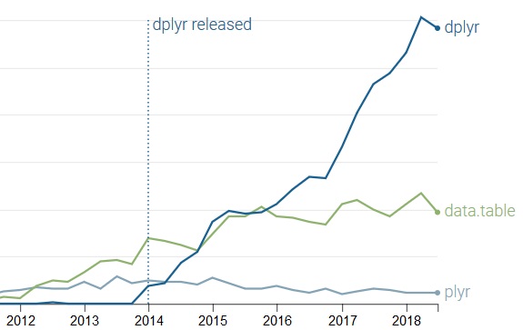
Two R packages--dplyr and data.table--offer similar tools for data manipulation, but appeal to different users.
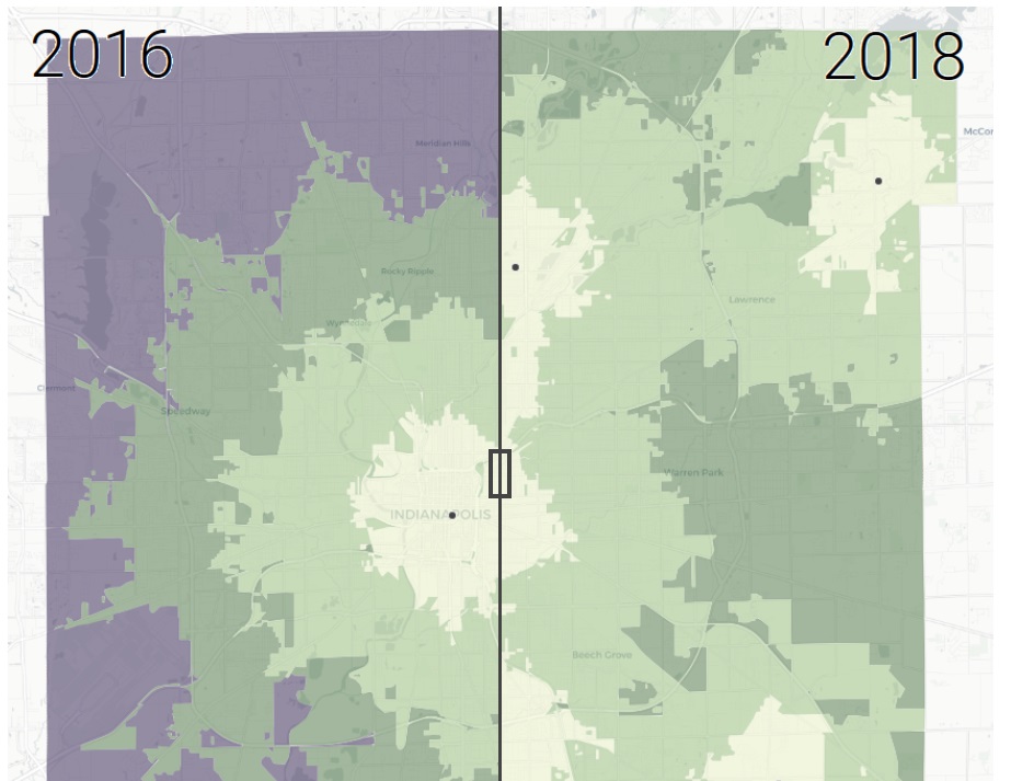
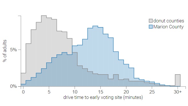
After lawsuit, Marion County voters will have unprecedented access to early voting.
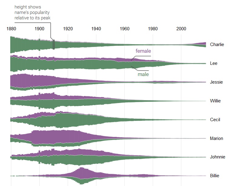
A visual history of unisex names in the United States
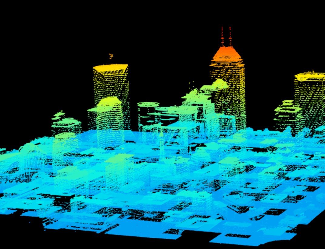
A new R package for ray tracing reveals the sunniest and shadiest locations in Indy's mile square.
A decade-long Republican scheme prevents Marion County voters from having the same access to early voting as suburban voters.
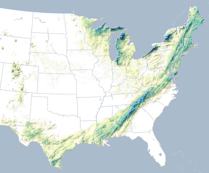
Colorful animations of 2018's biggest winter snowstorms.
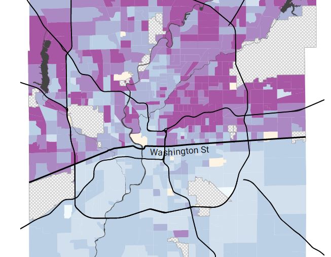
The Trump administration's new Medicaid policy does not protect all people with disabilities.

A recent IndyStar article might have overstated the disparity in pothole services.
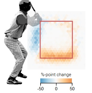
The strike zone in the MLB rulebook hasn't changed since 1996, but technological advances have forced umpires to change anyway.
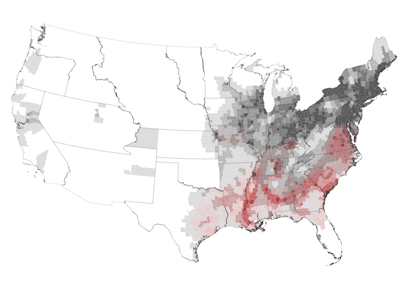
Interactive maps of the concentration of enslaved people from 1790 to 1860.
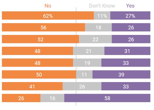
Opinions on the potential removal and preservation of Confederate statues are influenced by how the question is framed.
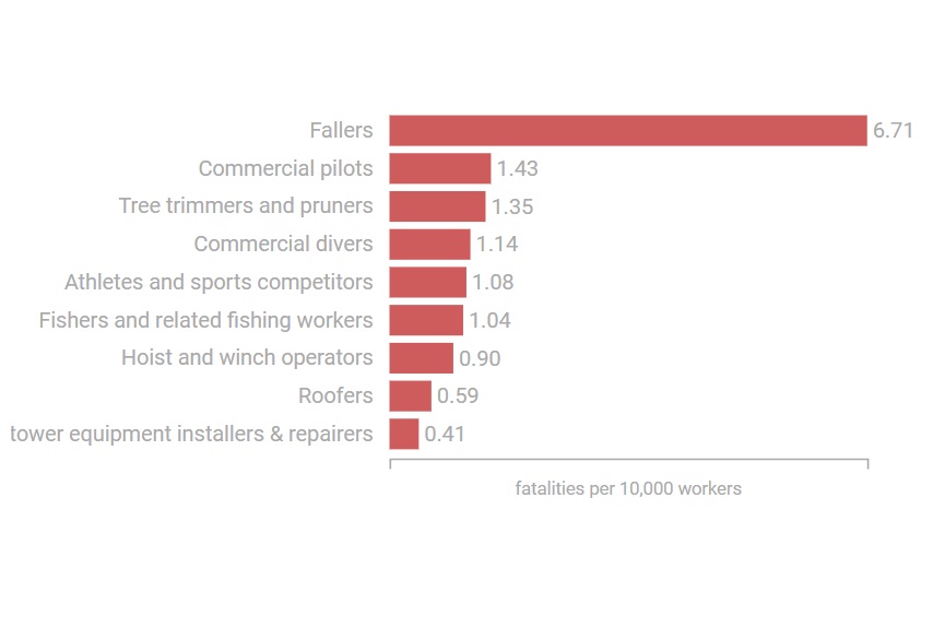
On-the-job fatalities have a variety of causes. Here are the top occupations for each cause of death.
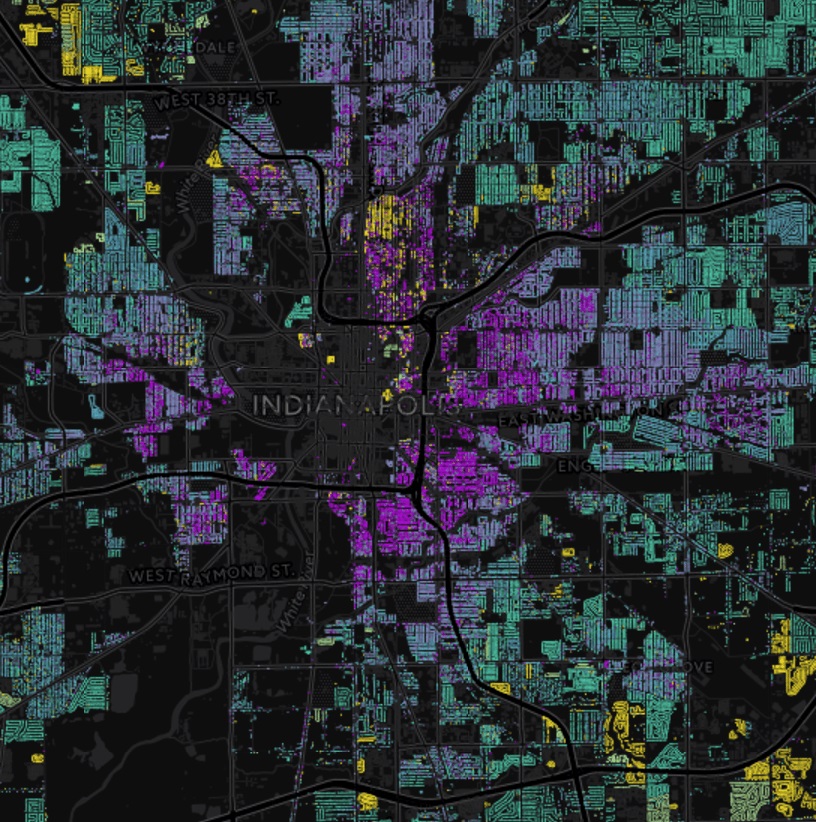
Matching building footprints shapefile published by IndyGIS to property tax assessment data for spring 2017 (via Renew Indianapolis) nicely captures the geographic variation of building age in Indianapolis.
David Waldron
David Waldron
David Waldron
David Waldron
David Waldron
David Waldron